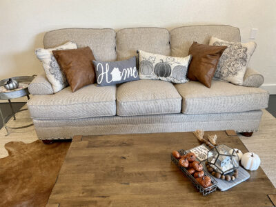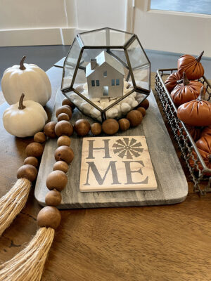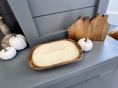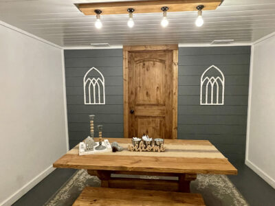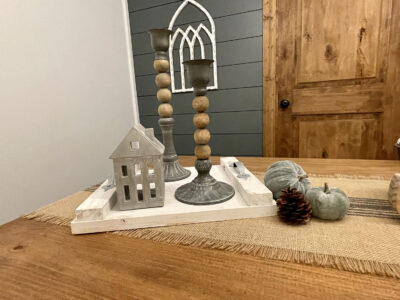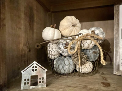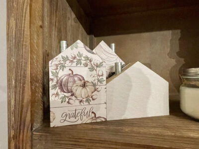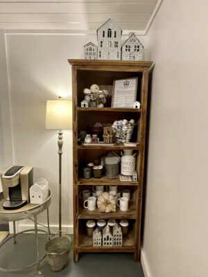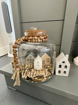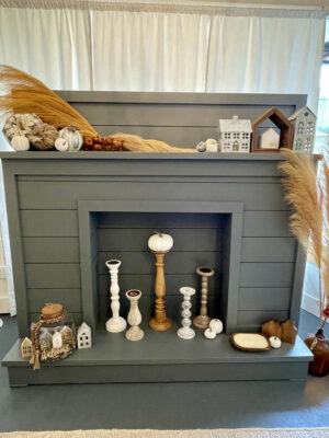
Our brand colors, here at McCabe Realty, are grey & white. We have two large shiplaps walls and a beautiful fireplace we’ve painted with what’s lovingly become known as ‘McCabe Realty Grey’. When I started planning/designing the office, I knew I wanted to accent those two colors with stained wood – specifically a reddish-tan & decided on ‘Early American’ as the stain color. Regardless of the season I’m decorating for, I like to keep the decor fitting to the theme/style of the office – so greys, whites, creams, tans & stained wood it is! Here’s how I decorate for fall at McCabe Realty (and SCROLL DOWN for all the photos of the decor magic!):
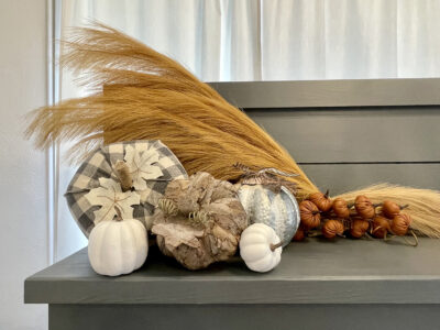
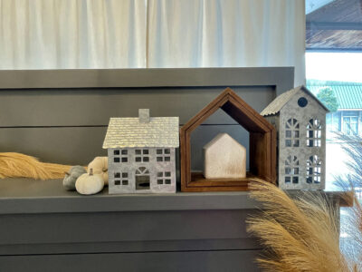
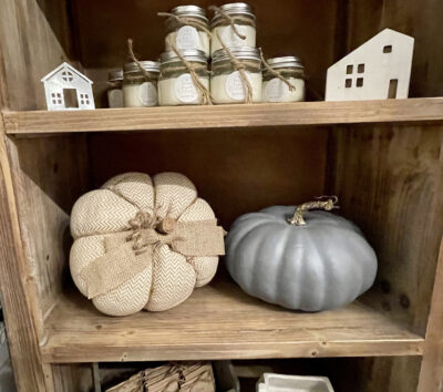
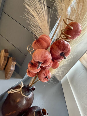
Most of my decor comes from the AMAZING Hobby Lobby, a beautiful shop in the Georgia mountains – Deerly Blessed & 2 local gems here in Macclenny and Raiford – The Weathered Wheel and The Lavender House. For fall, I’ve chosen camel colored pampas grass for a nice pop of color on the fireplace & of course, tons of pumpkins with several different textures and materials and colors that match our brand… One of my favorite finds this year are the mini leather pumpkins from Hobby Lobby. Everyone who walks into the office is immediately drawn to them! There’s also a mixture of tree bark pumpkins, metal, felt, velvet & more.
Looking for inspiration for your home? Follow these simple steps to create a beautiful look that’s all your own:
1.) Choose 2-3 colors that compliment one another as your main color palette. If you already have a color tone on your walls (or the main wall you’re decorating) – use that as one of the colors in your palette. Specifically look for fall decor in those colors.
2.) Choose an ODD number of items & DIFFERENT sizes. This is EXTREMELY important. Instead of purchasing 2 pumpkins, grab 3. A cluster of three is actually more appealing to the eye than the even number of two. AND – choose different sizes for those pumpkins. So, if the store has a small, medium & large of that pumpkin or item – get the variety – instead of three small… The size difference is also very eye appealing.
3.) Choose different textures. Just like in the photos above, mix a variety of cloth, wood, ceramic, painted, plastic, metal, glass, etc. The variation is aesthetically pleasing.
4.) Finally, when placing your decor in your home – continue to use variation. Group your different textures and sizes together & move your similar sizes & similar textures to different spots. Use the concept of layering – place some items further back and others up front. Your decor doesn’t have to sit all in a straight row – so layer them. For example, take a look at the candle sticks on the fireplace at the McCabe Realty office. They are staggered – a few are set further back on the fireplace and a couple are pulled forward closer to the front. Also, don’t be afraid to sit something on its side or at an angle instead of straight up & down. (If you don’t like it, you can always change it.)
I like to call the way I decorate: coordinated chaos, LOL! I want it ALL to match and flow (the coordinated) – but I don’t want any individual piece to be too matchy-matchy to the piece next to it (the chaos).
Happy Decorating!
P.S. Make sure to check out our recent blog post ‘8 Strategies to Secure a Lower Mortgage Rate’.
Anne McCabe, Broker/Owner

